The case for space in flipped learning
In my last post, I gave an overview of my talk at Merging Minds and Technology in Boston. Today, I wanted to focus on the end of that talk, which unpacked the concept of space a bit more. Here at Steelcase, I’ve been asked to think about the question, If you were to design a physical learning space specifically for flipped learning, what would it look like? I love this question because it makes me think carefully about the resources that flipped learning requires1. Maybe “requires” is too strong — there are lots of examples out there of flipped learning being done successfully in a wide variety of settings, including those where fancy classrooms and high-tech devices are difficult to come by. But flipped learning also carries with it some implicit demands on physical space, and if we can meet those demands then the experience becomes richer.
To answer this question, I’ve been going back to two things. First, the definition of flipped learning, which states that
Flipped Learning is a pedagogical approach in which first contact with new concepts moves from the group learning space to the individual learning space in the form of structured activity, and the resulting group space is transformed into a dynamic, interactive learning environment where the educator guides students as they apply concepts and engage creatively in the subject matter.
The second thing is the Four Pillars of FLIP, the first of which (“F”) is a flexible learning environment. From the website:
Flipped Learning allows for a variety of learning modes; educators often physically rearrange their learning spaces to accommodate a lesson or unit, to support either group work or independent study. They create flexible spaces in which students choose when and where they learn.
So the physical space for a flipped learning course has to enable active learning and allow for a variety of student choices in how they engage in this. What does this look like? I’m still thinking through this, but here’s what I’ve got so far.
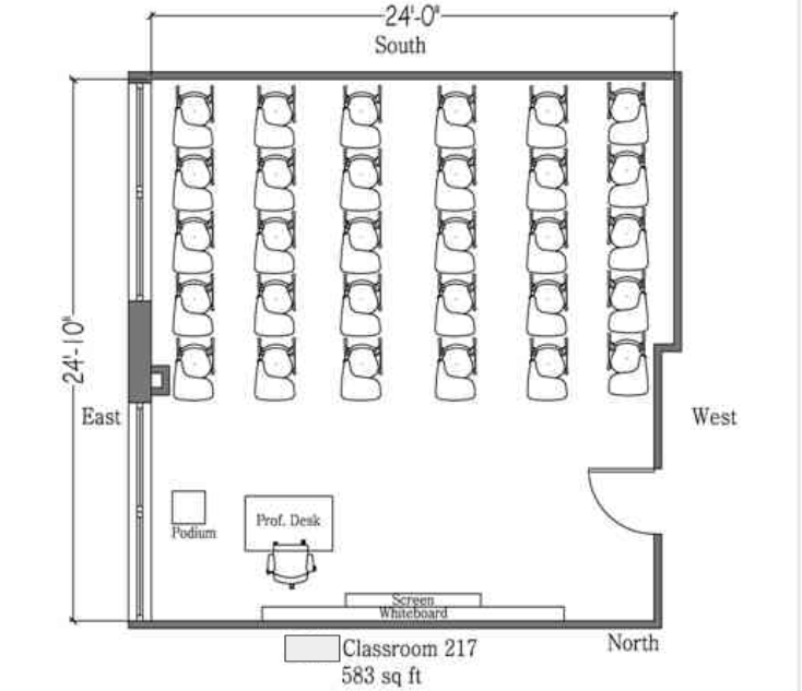
First: The default setting for a flipped learning space should be “social”. In flipped learning, the group space is focused on group-active experiences. We all know that classroom space can either enable or inhibit such experiences. Take this classroom floor plan for example:

Can social activity take place in this classroom? Sure. Is it the default? Not by a long shot. Everything about the space says “sit still, face forward, and listen to the teacher”; any group work you do is going to have to overcome the defaults of the space first. This makes it ill-suited for a flipped learning design. Instead, we’d like to have a space that says to both the students and the instructor that social interaction is not only welcome but is the default.
Second: While social interaction is the default, a flipped learning space should allow for a range of social activity, including the choice to work individually. Some students may arrive at the class meeting ready and willing to work in a small group. Or, you may have half the class not understanding a particular concept from the Guided Practice and need a dose of direct instruction in a group of, say, 10 or 12 students. Or you may have some students who are prepared to work on the in-class activity but who are introverts and learn best if they work in quiet and relative isolation2. Most likely, you will have a combination of all of these. The physical space should accommodate the full range of social activity, including the choice to work with no social activity, if only just for a few minutes of the meeting.
Third: A flipped learning space should enable the use of technology while providing a balance between digital and analog. While flipped learning is tech-agnostic — it’s perfectly possible to use little to no digital technology and have a good flipped learning experience — technology is often a great enabler of the experience, so the space should make it easy to use whatever tools match the work best. In flipped learning we do not subscribe to the idea that laptops should be banned wholesale from the classroom but instead believe that students should be given difficult, interesting things to do during class meetings that might benefit from the use of technology. But note, this is sometimes but not always digital tools. As I wrote in another post, analog tools like pens, paper, whiteboards, physical manipulatives, and mechanical devices are often far superior to digital tools for the kinds of learning experiences we want to have in a flipped learning environment. So those should be plentiful and easy to access too.
Fourth: A corollary to the third point, a flipped learning space should enable the capture and streaming of information. We often speak of “flow” in reference to a classroom, referring to the flow of traffic, the flow of air, or even the state of flow that we want to see students attain during a class meeting. For flipped learning, the flow of information is just as important. Some of the students showing up for the group meeting may need to review the videos3 or access other review material. Small groups may be called upon to present their work, either digital or analog. Information needs to flow, be captured on the whiteboard or on a screen for discussion, and be accessible to individuals, small groups, and the whole class.
Fifth: A flipped learning space needs to be massively multimodal. By this, I mean that several different activities could be going on under the same roof. In a class of 30, you might have 15 students working in small groups on an activity; 10 more who were stuck on something and need a quick dose of instructor-led direct instruction before they join the other 15; and maybe 5 students who just need to work in peace and quiet and can have the same active learning experience as the others if they are left alone. All of this needs to be accommodated by the same classroom. This is hard, and the need to be massively multimodal is one thing that sets flipped learning apart from other forms of student-centered instruction. Elementary school classrooms often do a good job with this, because they have to. The same classroom will house 25 or more third graders throughout an entire school day. Those kids all have separate learning needs from each other; and each kid will have different learning needs at 10:00am than she has at 2:00pm. So you have to have a space that lets all students do what they need to do, all the time.
Sixth: A flipped learning space needs to be reconfigurable. In higher ed, profs don’t have the luxury of having their classroom, a space in which they teach all their classes all day long4. We come in, teach, and then get out of the way for the next prof. So to have massive multimodality in a space we inhabit for only 50 minutes at a time, the space has to be changeable from one state to another without a lot of hassle — for example, going from large-group direct instruction (32 chairs facing a well-defined front of the classroom) to a space for group work (8 groups of 4 students each) to a mix of these plus individual space, and that change cannot involve a lot of work.
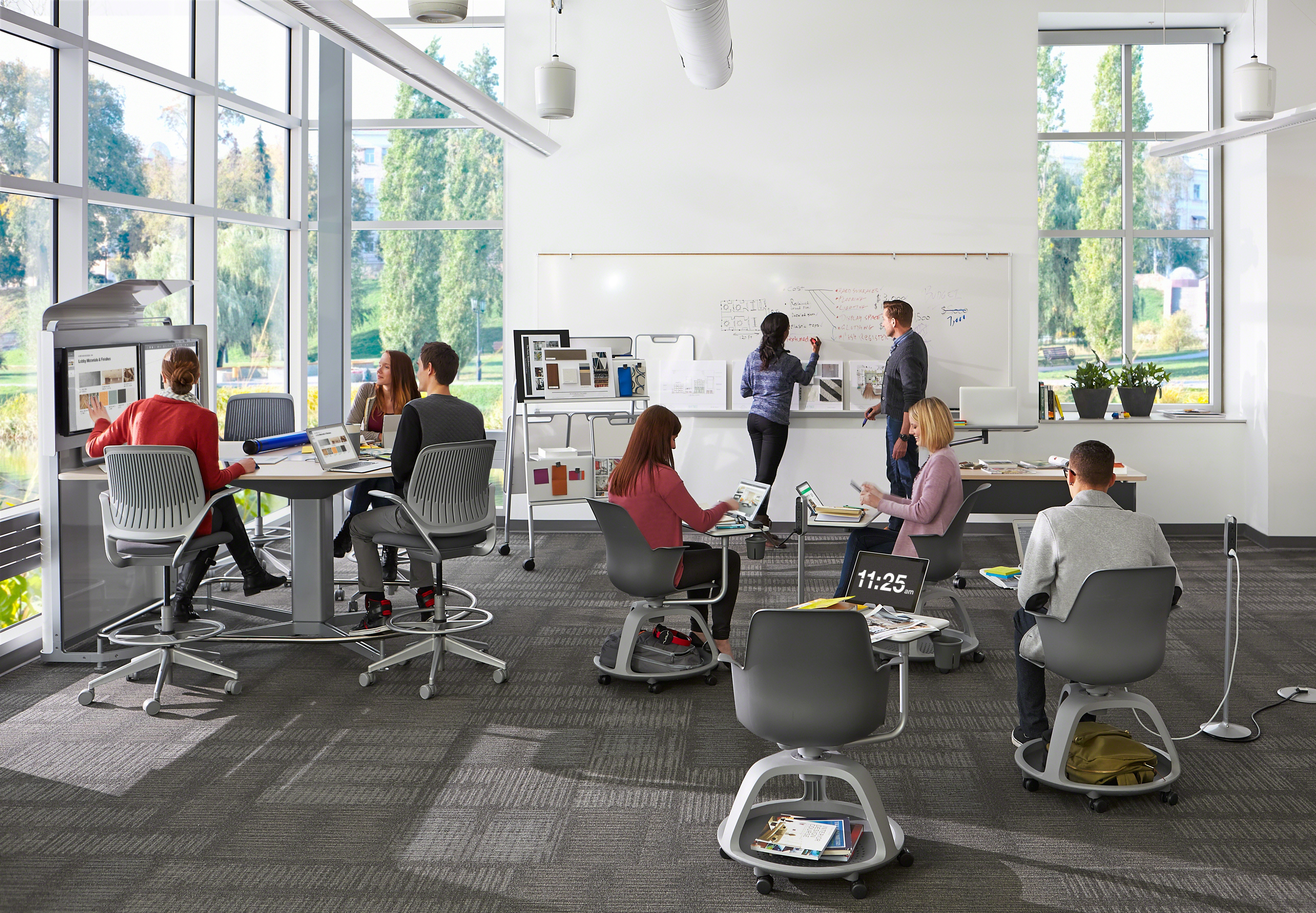
So what does such a space look like? I don’t know if it’s been built yet, but here are a couple of Steelcase designs that get at the right ideas. First, this:

In this space, the default is clearly social, with no “front of the room” to bias a student into thinking that the room is about lecturing. You see different levels of social interaction, including a student working individually and another student who was working individually but is now getting some help at the whiteboard. The space is tech-friendly and includes a nice mix of digital and analog. (Note especially the Thread moveable power supply that keeps students from fighting over power outlets — a very simple step towards being tech-friendly.) Information is being captured and streamed via the flat-screens at the table and on the whitebord. And notice, everything is on casters, so if you needed to snap the group around to face the whiteboard for a quick minilecture, you could do so in seconds, and then deconfigure it back into something else equally easily.
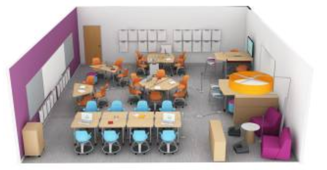
Here’s another:

This one’s a cool design because it includes all kinds of different spaces, including group areas for two, three, four, and six students — and a sweet “hideout” for two students working individually in the lower-right corner. As an introvert, I know where I’d be heading in that class if I had the choice. (And I love that big lamp that “shades” the hideout.) And, all of the furniture except those in the hideout is on casters, so it could look like a lot of different things. Note the mini-whiteboards all along the wall for analog capture and streaming of information. And amazingly this space holds 34 students — it feels both larger and smaller than that.
What do you think? What aspects of flipped learning can be helped or hindered by the way we design the physical space?
Note: All images in this post are property of Steelcase and used by permission.
-
In the context of this article, we’re assuming either a face-to-face class design or a hybrid design where there is significant face-to-face group interactions. Fully online courses are different. ↩
-
Here, I have to give a hat tip to Susan Cain’s book and what I learned from it. I encourage everyone reading this, to read her book and apply it to your teaching. ↩
-
Although I remind you all that videos are not necessary for flipped learning. ↩
-
I’ve often wished this were the case for myself, and I would gladly give up my private office if I could have my own dedicated classroom space with an area for private work embedded in it. More on that later, maybe. ↩

Leave a Comment